Structure of a Component Library in Figma: Banking App Case
In the previous article, we talked about our experience optimizing a Figma project using a large banking application as an example: the file started to slow down significantly, and over time we came to understand how to solve this problem.
In the previous article we talked about our experience optimizing a Figma project using a large banking application as an example: the file started to slow down significantly, and over time we came to understand how to solve this problem.
In this article, we will focus on how we organized the component library after optimization: we will discuss its structure, naming logic, and the placement of elements.
We, the design studio Mish, spent a long time designing two mobile applications for SBI Bank: the classic banking app for adults and a separate banking app for children.
After six months of work, the project files began to lag heavily, so we started a full-scale optimization. We decided to organize the library so that complex components were built from simple ones, with several levels of nesting: the smallest elements are icons, fonts, and geometric shapes; the largest are lists, cards, and screens.
Component Structure
Let’s show what the component consists of using the example of a list row with a height of 64px — one of the most common elements in the project.
There were more than thirty layout variations of such a list block: with and without an icon, with one title or a title and subtitle, with an amount and subtitle or with an amount without a subtitle, with a button instead of an amount, and with an arrow instead of a button. In addition, each variation had loading states and dark background states. We separated all these variations into individual components. Why we did this is described in the previous article .
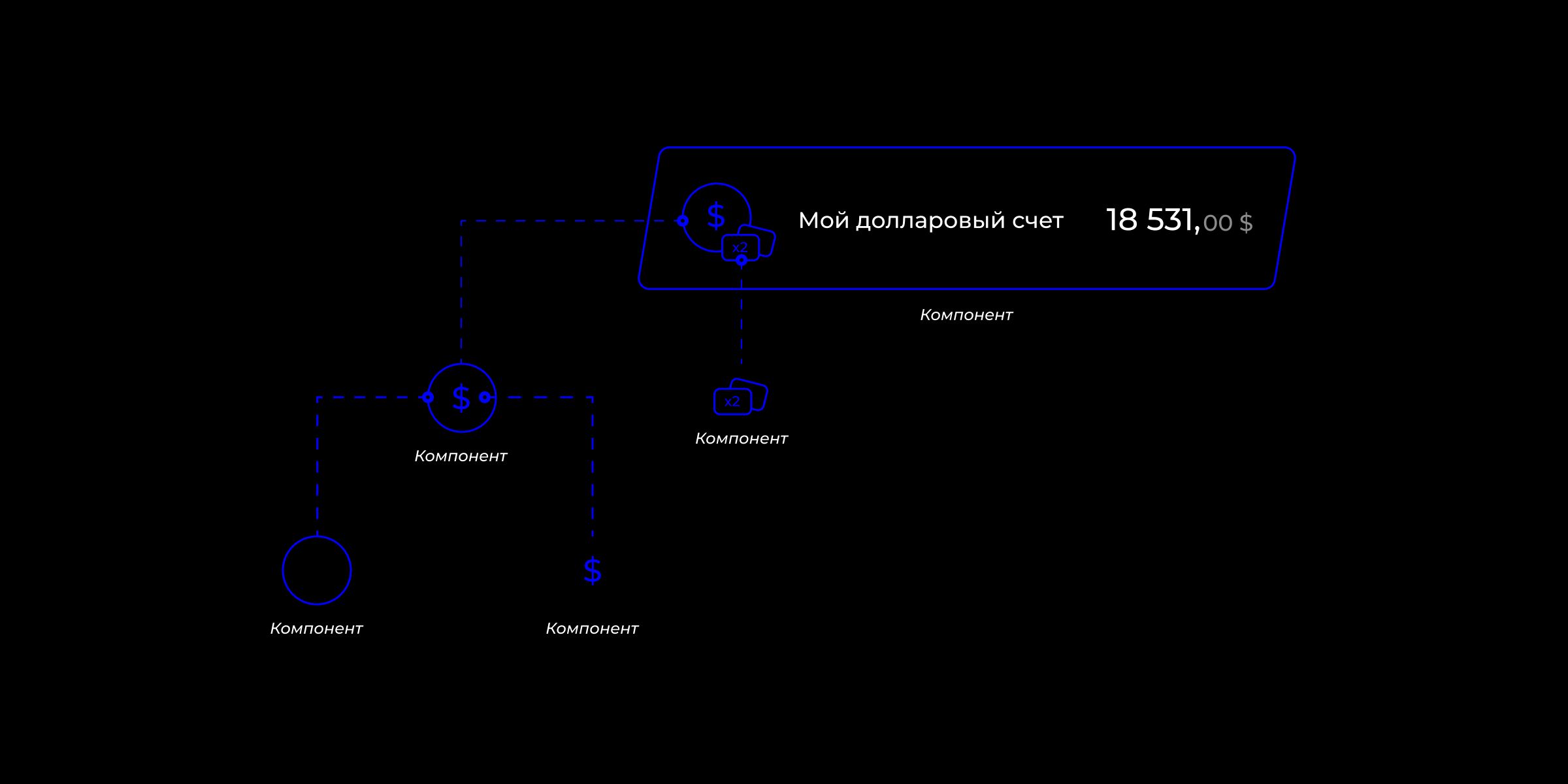
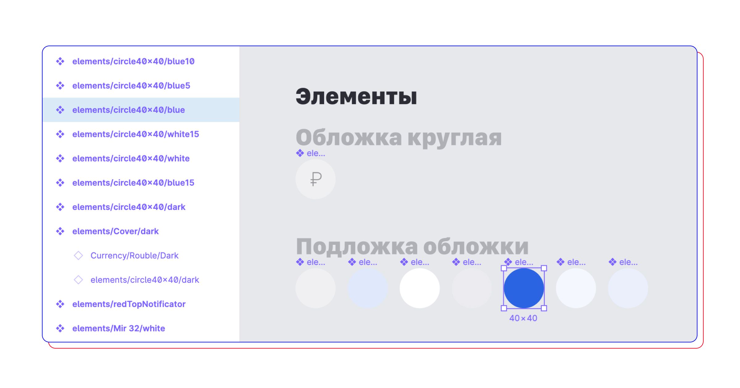
A standard list component consists of a background, text, amount, and several nested components. The latter, in turn, contain another level of components: for example, the list cover component consists of a circle component and a dollar icon component.
Any other icon can be placed instead of the dollar icon — a ruble icon, a transaction category icon, or a restaurant logo. The icon component is the smallest object in the structure, and there are about a hundred icons of similar size in the project. This list layout is used in all sections of the app: on the main page, in the history, in the profile, and on internal screens.
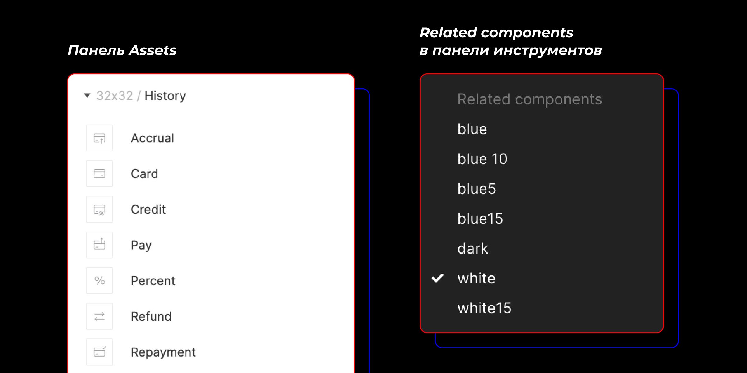
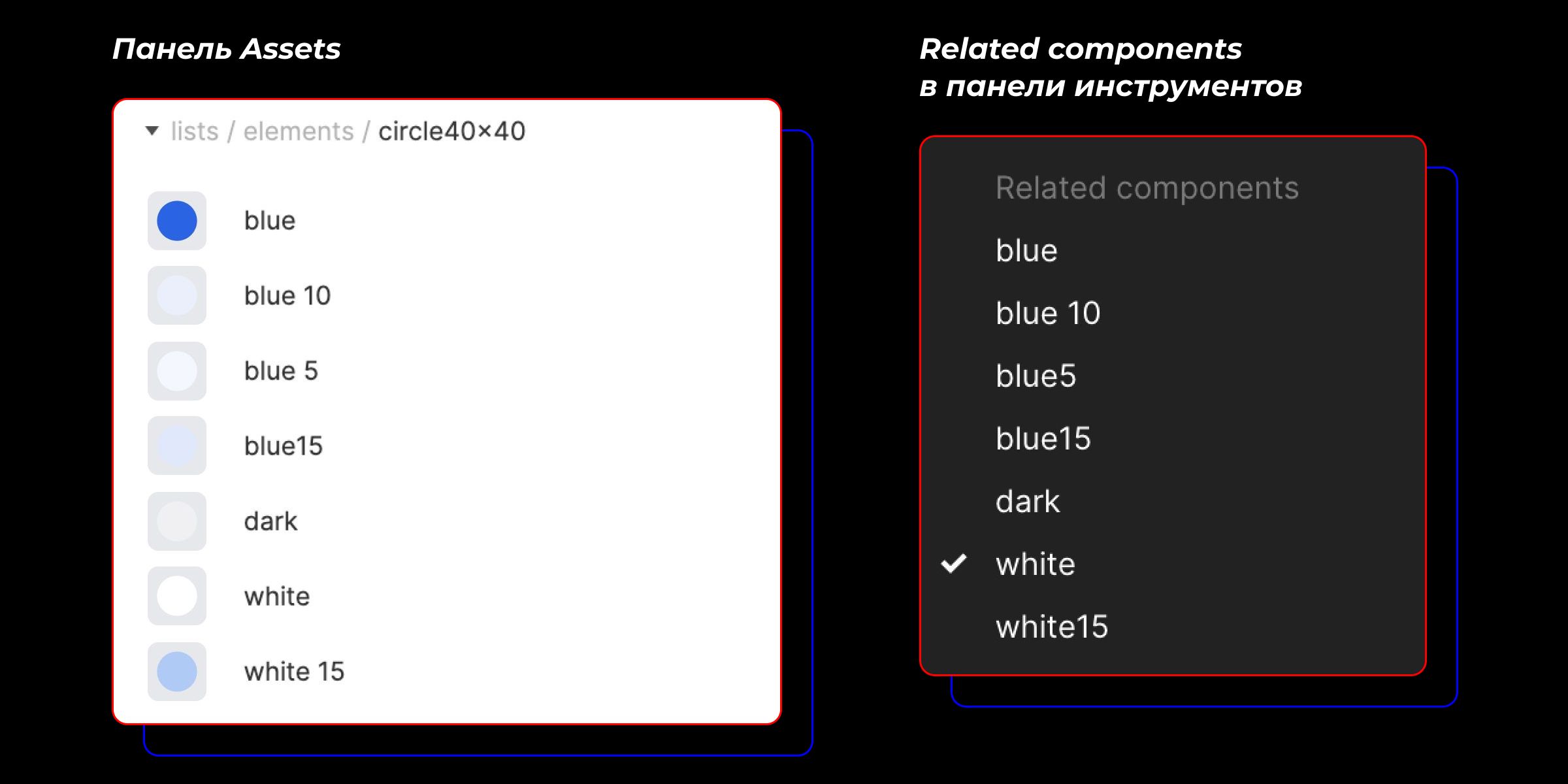
To place another icon on the cover instead of the dollar sign, drag it from the Assets panel while holding Opt+Cmd. The Assets panel is the second tab of the left layer panel. Shortcut to quickly open Assets — Opt+2. It is important that the new icon be the same size, for example 24×24, otherwise it will shrink or stretch when replaced.
It is more convenient to change the background of the circle under the icon through Related components in the right tool panel. Another way to change the background is to modify its color through the style or palette. But we decided to pack everything into components as much as possible and created six cover components for different colors. Thus, if we need to change the background color throughout the project, we can do it faster.
There are also separate cases when you need to place a company logo, for example, a mobile operator’s, on the list cover. To do this, disable the icon visibility on the child component and change the background fill to the desired logo through styles. Beforehand, all logos and avatars must be added to the color styles.
Path to a Component
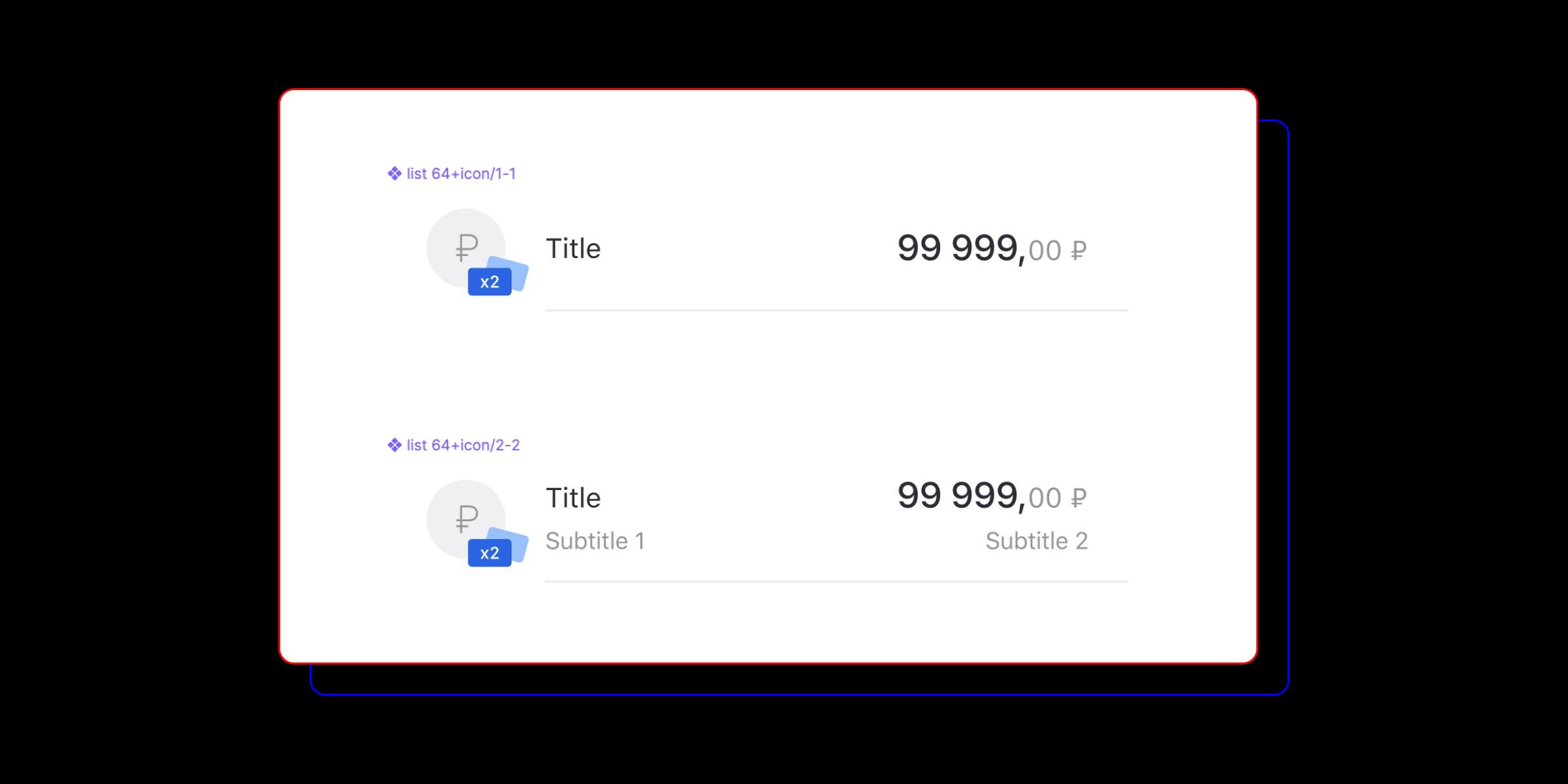
We mentioned above that the list row block has several layout options, and each of them is a separate component. The picture shows two similar components. They differ slightly in layout.
list64+icon/1-1— list element with one title and amount.
list64+icon/2-2— with a title, subtitle, and amount with a subline.
There are about thirty similar variations, but we will not show them all. It is important to note that if these elements are named correctly, you can easily switch between them and replace one block with another. This can be done in any convenient way: by dragging from the Assets panel or switching in the component panel.
A great lifehack: to keep the title text and amount when replacing one component with another, the layers of these elements must have the same names. This is also very useful when modifying input or button components.
To make the necessary components appear in Related components, it is important to name them correctly. For example, the background components for icons in our project are named approximately as follows:
componentsAndroid/lists/elements/circle40×40/dark
componentsAndroid/lists/elements/circle40×40/white
componentsAndroid/lists/elements/circle40×40/white15
componentsAndroid/lists/elements/circle40×40/blue
componentsAndroid/lists/elements/circle40×40/blue5
componentsAndroid/lists/elements/circle40×40/blue10
Now let’s look at what the full path to the components consists of.
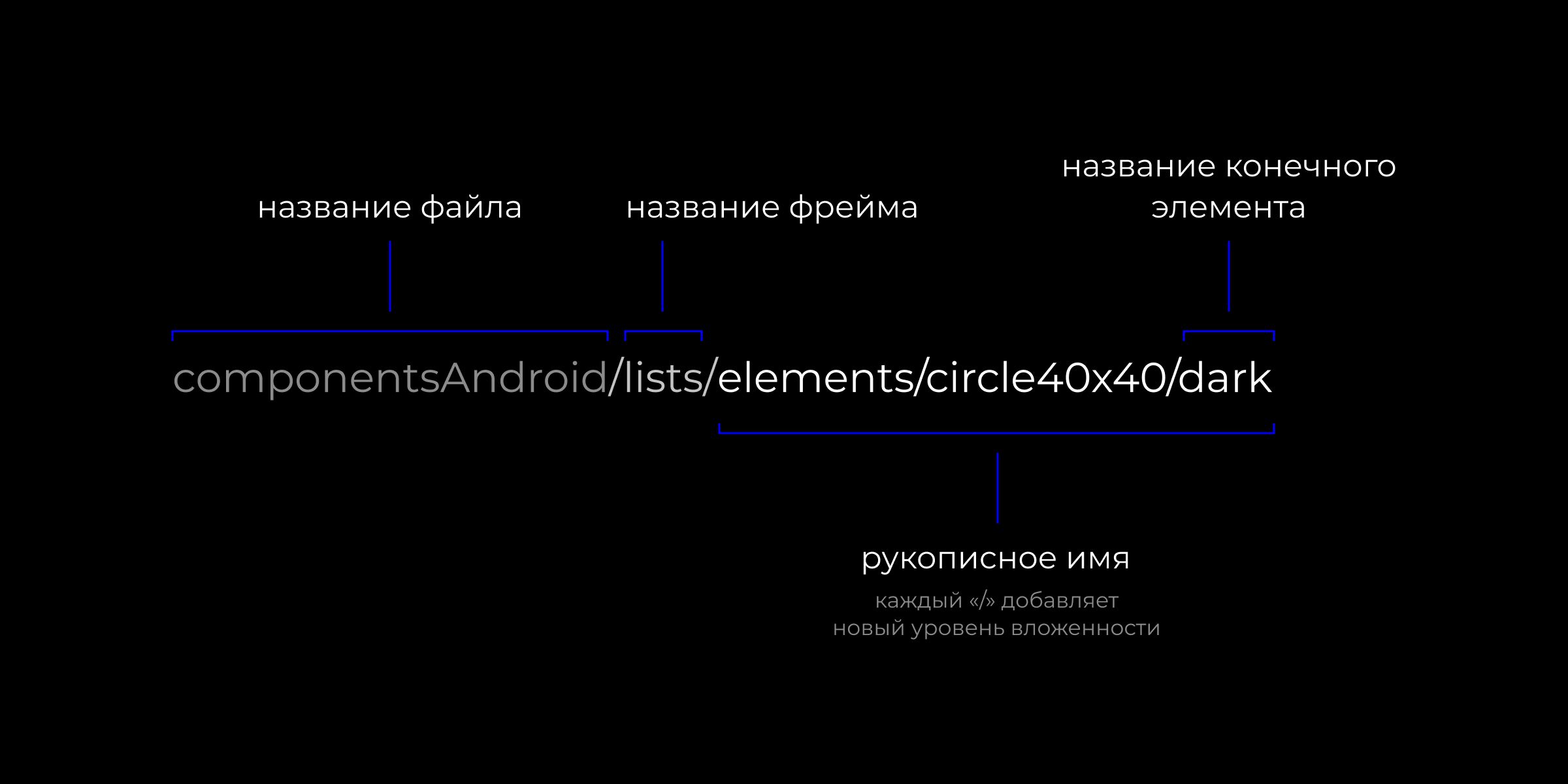
componentsAndroid— file name.
lists— frame name in the file.
Then comes the custom name, each element of which between “/” creates another nesting level. Finally, the name of the element itself.
Another nesting level can be created by dividing the file into pages.
If several components have identical names for all levels up to the final element, Figma considers these components to be in the same group. It allows you to replace one component with another in one click and stores them together in the Assets panel.
Each designer decides the order of this path depending on the specifics of the project and convenience of use.
In some cases, it is convenient to make the color the last point, which, as in the example above, allows you to quickly change the color of the background under the icon. In other cases, it is more convenient to name elements by another principle — for example, by the element’s state: Enable and Disable, Hover and Active.
To avoid redesigning, it is important to think through your structure at the very beginning and sketch it out. But even if you made a mistake in the structure, do not worry, just rename the master components in a way that is convenient for you. Figma allows you to do this at any time, and it will not take long. You can also speed up the renaming process using plugins
Path to a Component
We organized the library into three files:
- A file with icon and illustration components common to both platforms
- A file with iOS element components
- ФA file with Android element components
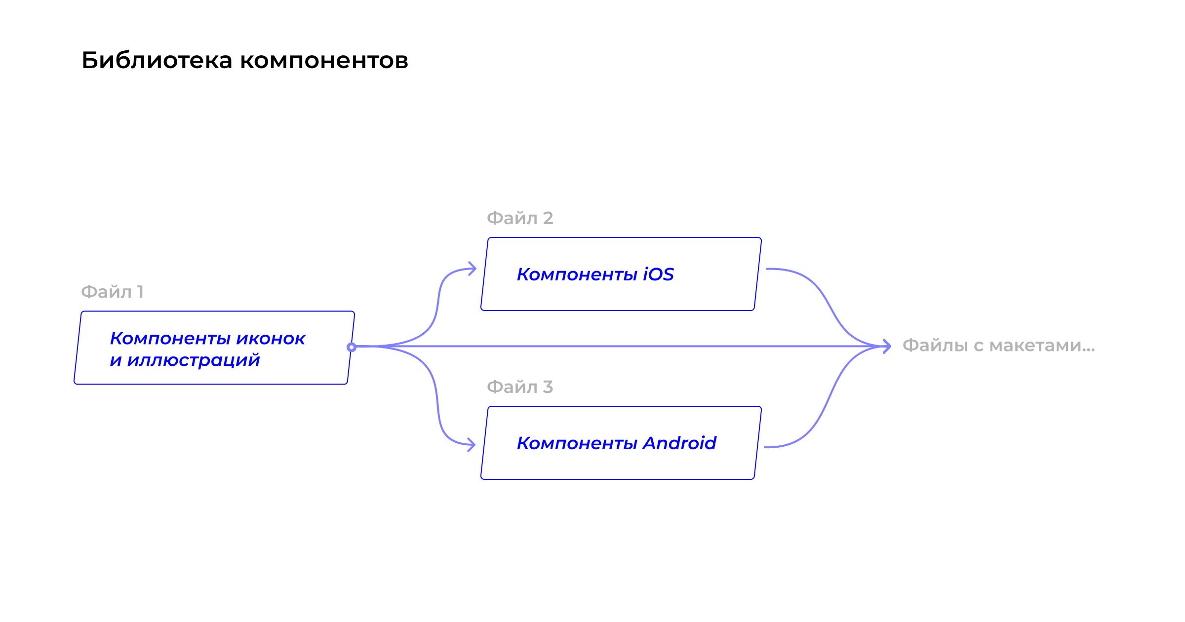
If the project includes more than a thousand screens, we recommend storing components in separate files. To find out what can happen if components are stored in one file with layouts, read our previous article.
Conclusions
- If your project includes more than a thousand screens, store components in separate files.
- It is better to make different element states as separate components rather than hidden layers. Icons should be switched in the component panel.
- Name components and layers meaningfully. Use nesting with slashes “/” and hierarchy inside the file: file name / page name / frame name / internal hierarchy with “/”.
- Plan the library structure in advance to save yourself time in the future.


More articles
Next article
How AI Turns Designers into Creative Multitools
Hi! I’m Sergey, a graphic designer at Mish Product Lab. At some point, I was replaced by neural networks or maybe I just learned to work with them. In this article, I’ll share how I tamed artificial intelligence, multiplied my own efficiency, and stopped fearing that one day I’d be out of a job because of a machine.

