
Comparing Mobile Banking Apps for SMBs: Key Takeaways
A mobile application is not just an alternative to internet banking. For small and medium-sized businesses (SMBs), it's a workspace that's always in your pocket, providing access to account management, document signing, payment monitoring, and urgent transfers. Everything should be as accessible and intuitive as possible. We conducted a comprehensive study of mobile banking apps to test how well they handle these requirements in practice.
The Method Behind Our Research and Its Value for Business
Recon, our research team, studied six mobile apps from major banks and well-known neobanks. Our designers reviewed the apps using Bruce Tognazzini’s principles and Jakob Nielsen’s heuristics. Then we asked entrepreneurs, CEOs, accountants, and employees who use mobile and online banking to test 11 key tasks — from logging in to sending payments and setting tariffs.
To assess how effective these scenarios are in mobile banking apps, we relied on proven methodology that our team had previously used in internet banking research.
First, experts evaluated the interfaces based on accessibility, logic, and communication quality criteria. Then, real users performed these same scenarios live. As a result, we obtained expert assessments of the applications as well as feedback from the target audience: where people get lost, what causes frustration, and which elements are perceived as convenient.
What Works Well
1. Contextual Access to Data
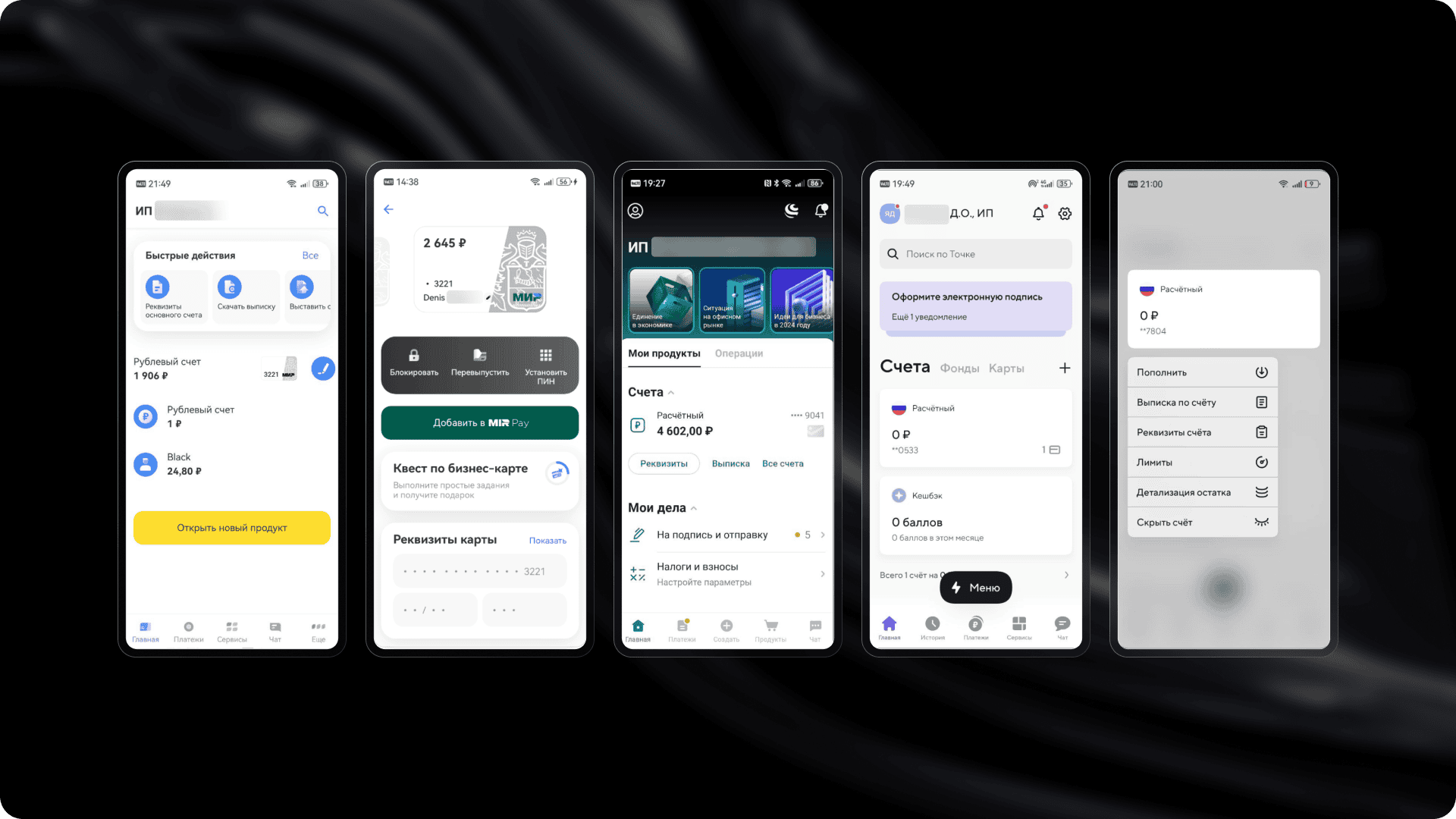
The best apps don't make users remember where a needed function is "hidden." For example, you can copy account details right from the home screen without going to a separate section. From there, you can also generate a statement or open a new card. This significantly reduces task time and lowers the risk of errors.
2. Smart Interface Customization
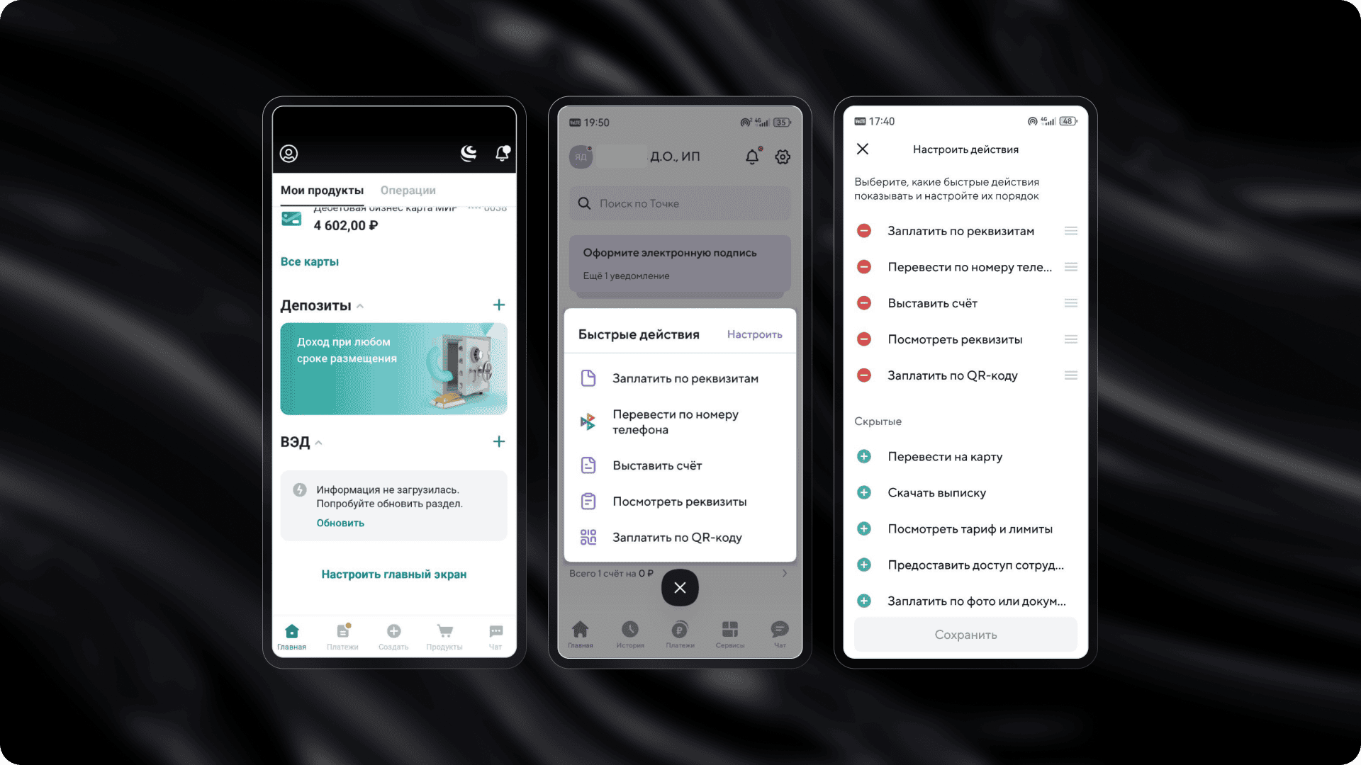
Interfaces where you can hide unnecessary blocks and change the order of sections get positive feedback from users. Personalization is especially useful for those managing multiple companies or working in a "multi-tasking in a minute" mode.
3. Forms with Smart Suggestions
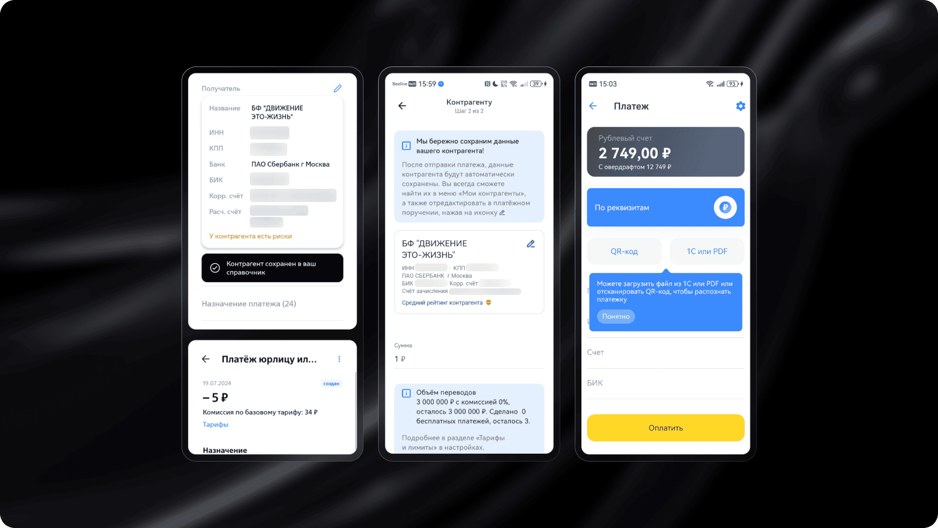
In successful implementations, forms automatically suggest what and how to fill in. They support auto-detection of TIN (Taxpayer Identification Number), integration with 1C software, and show fees before you press "Send." This increases transparency and reduces anxiety.
4. A Marketplace That Actually Works

A well-implemented marketplace is not just a showcase but a tool for solving problems. Apps where you can quickly find a credit product, view its description, set loan parameters, and proceed to application build trust and boost engagemen
What Hinders Business
- Complex Onboarding. The first login is one of the most critical moments. If authorization requires unnecessary steps and the demo mode is incomplete or inconvenient, users lose trust from the start. Some apps don't even provide a simple way to preview the interface before registration.
- Confusing Logic. In many apps, scenarios are scattered across different sections without clear logic. For example, transaction history might be hidden at the bottom of the main screen, with no way to access details. Users scroll through feeds looking for what they need, can't find it, and give up. Another example is sharing account details – in some cases, the "Share" button is either invisible or implemented with an icon that users don't recognize.
- Lack of Global Search. Functionality may be advanced, but if users can't quickly find the right section, they simply won't know such scenarios exist. In some banks, search doesn't return relevant results, while in others, it doesn't work at all.
- Poor Visual Hierarchy. Dense layouts, weak emphasis, and cluttered screens all hinder perception and cause fatigue. This is especially problematic in important sections like account analytics or "work in progress" (document signing, status tracking). Sometimes users don't even realize they're looking at important information.
Why This Is Critical
A banking app is not just an interface – it's a way to manage business. If the interface is inconvenient, it affects not only user perception but also company process speed. Delays in document signing, errors in account details, or missed notifications translate to real money and time losses.
The Finalists: Lessons for Your Business
Based on the research results, we identified three leaders: Tochka (181.6 points), T-Business (173.9 points), and VTB Business Platform (171.4 points). All three applications showed a high level of detailed scenario development, clear navigation, and a focus on real tasks for users from small and medium-sized businesses (SMB). However, each finalist approached solving these tasks in its own way.
Tochka stands out with deep personalization, a convenient home screen with quick actions, thoughtful storytelling (in the format of stories), and a product showcase with filters and direct ordering options. The app adapts to the user and allows working at the pace of the business without needing to search for the right function.
T-Business offers instant authorization and interactive onboarding, quick access to details and documents, and flexible notification settings. The bank demonstrates a high level of integration with the ecosystem and automation of routine tasks.
VTB Business Platform focuses on multi-bank features. Users can manage accounts from different banks in one app. It also includes the "Important for Today" function, which collects tasks and statuses in one place, helping users avoid missing critical actions.
The finalists not only offer a wide range of features but also handle complex tasks in a user-friendly interface. This is exactly the approach that modern businesses expect: fast, clear, and without barriers.
If you want to get the full version of this research, contact us.
Want to Know How Users See Your Product?
A banking app is not just an interface. It is a way to manage a business. If the interface is inconvenient, it affects not only user perception but also the speed of company processes. Delays in signing documents, errors in details, or missed notifications mean real money and time lost.
Instead of general discussions, we provide clear conclusions, problem areas, and a growth map that you can work with.
If you want to participate in the next research or order an audit of your interface, write to us at hello@mish.design.
The research involved Denis Yagubtsov, Director of Digital Financial Technologies at Globus IT.


More articles
Previous article
Optimizing a Figma Project Using a Banking App as an Example
We’ll explain how we optimized and sped up large Figma files by three times. This effort was prompted by slow and sometimes unopenable files on the project team. The problem was particularly noticeable for team members with less powerful hardware: files were loading for five to ten minutes.

Next article
A Small Solution for Big Goals
Remember when business chatbots were the trend, and every company rushed to launch its own digital assistant on Telegram, VK, or other platforms? Today, chatbots are just a basic cog in the customer communication machine. Users, meanwhile, have become more demanding — functionality alone isn’t enough anymore. They also expect great design and a pleasant experience. That’s where mini-apps come in. Let’s talk about what they are and how they help businesses grow.
