GOST Busters: How We Developed a Custom Version of “Start the Game”
A story about how we created a GOST-compliant version of a website in collaboration with Goose Gaming. All for a competition by the presidential platform "Russia — Land of Opportunities" for gaming industry talents. We share the pitfalls that arise when adapting a website for people with disabilities.
How We Built a GOST-Compliant Website with Goose Gaming
When Goose Gaming approached us to create an accessible version of their gaming website for a talent competition hosted by Russia's presidential platform "Russia — Land of Opportunities," we knew we were taking on something special.
We won't bore you with the official GOST requirements—Russia's state standards for web accessibility. Here's a quick list: we needed to work on settings for the visually impaired — develop speech synthesis, change font size, increase contrast. At the same time, ensure the site can be navigated via keyboard and that there are no time limits for properly perceiving and using the content.
We're happy to participate in a socially significant project, as companies rarely think about special versions of websites. Because of this, people even with common conditions cannot use products without assistance.
Julia Semenchuk, Head of Development and Product Management at Mish.
We Created the Problem — We Solved It
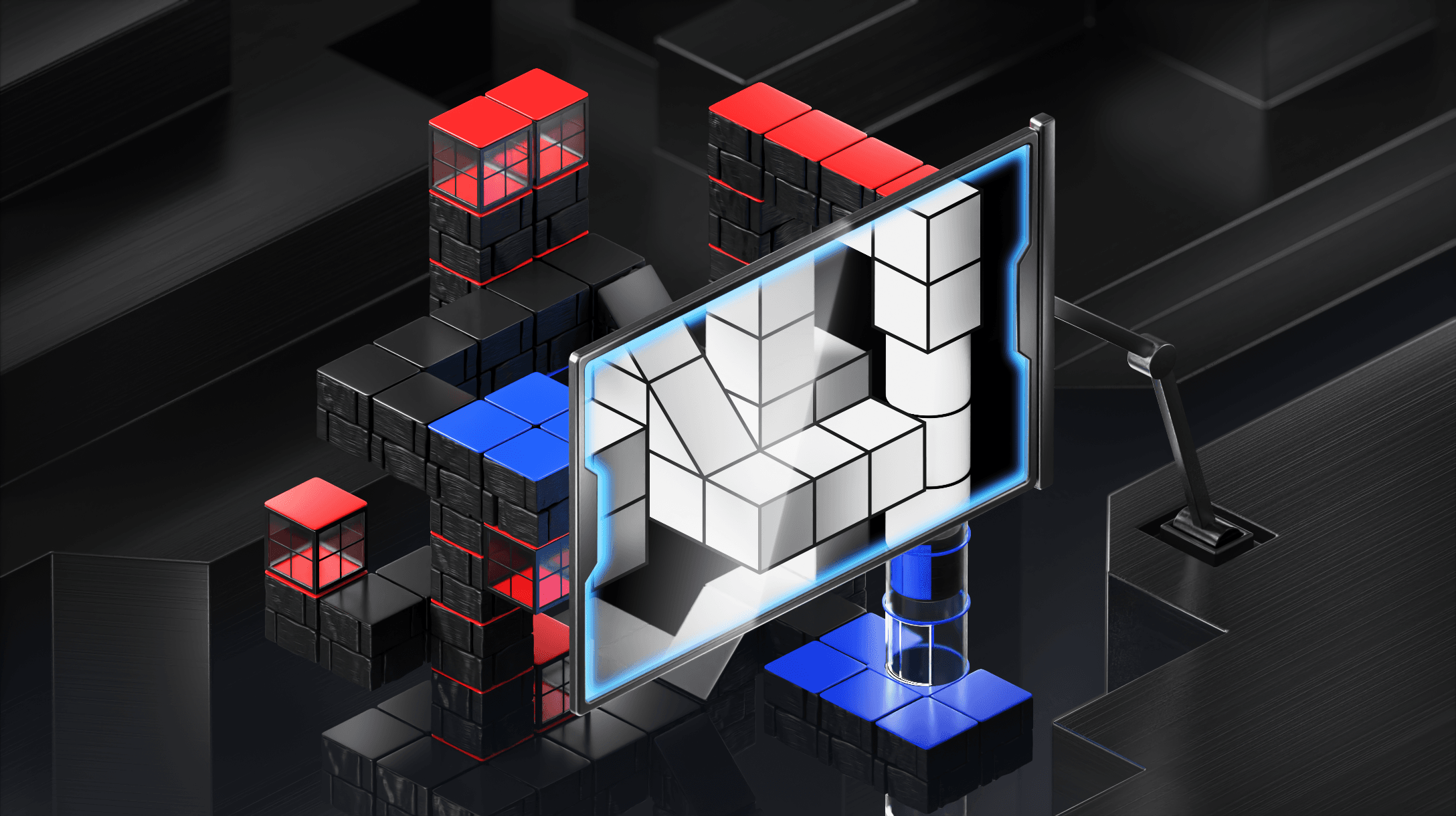
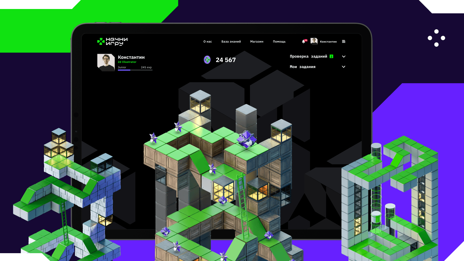
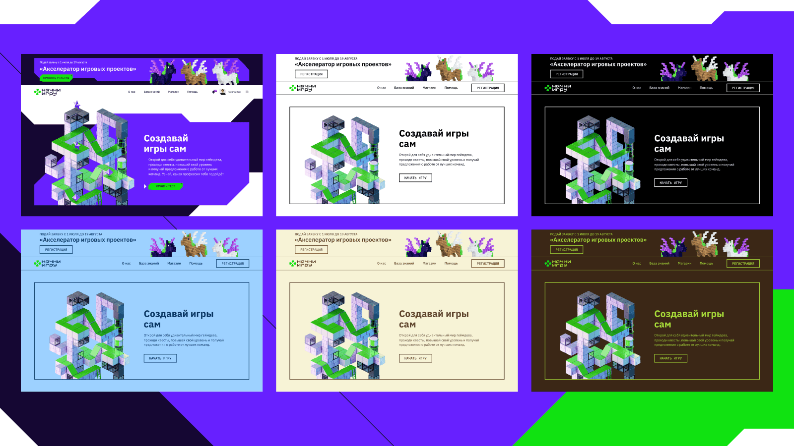
Interface accessibility depends on design. Initially, it consisted of broken, intersecting elements and we liked it. But when we started adapting the site to GOST standards, the beauty broke. Tabs and buttons stopped highlighting from the keyboard. This is because the broken design was achieved by cutting off the excess part of the element, and the focus outline fell under the cut-off element. A unique experience for us, but not for our frontend developers. They complained a lot since they had to redo everything, so consider requirements at the design development stage.
How We Coded It
First, we needed to work out the order of elements. On tablets, mobile versions, and desktop, they should be arranged in the same order, not shift or blur. Therefore, we used responsive layout and designed several mockups for main device resolutions.
After that, we concentrated on creating ARIA attributes, which allow explicitly indicating what state the menu is in and adding readable text to graphic elements. In general, they help screen readers more accurately read the site, context, quotes, buttons, links, describe images, icons, etc. However, ARIA attributes need to be used consciously and not overdone, so as not to complicate screen readers' work.
Screen reader is a program that converts interface content into speech or Braille. They are needed by people with blindness and visual impairments, as well as users with cognitive features who find it easier to perceive information by ear. For example, people with dyslexia.
Of course, we couldn’t skip using semantic tags — they’re essential for proper SEO optimization.
Set Up and Save
It's very convenient when special version settings are saved when revisiting the site, but there are cases when several people use one computer. Therefore, during development, such a scenario appeared: when a user enables the special version of the site, they see it in the state they configured it. Font size, line and letter spacing, color scheme are saved. But when revisiting the site or reloading the page, the special version is disabled so the current user can decide whether they need the special version or not.

What About Images?
GOST requires that the site has a function to disable images while preserving text content and voice-over. This way, users with impaired perception of small and bright images will find it easier to use the site.
To describe how we did this, we'll tell you a bit of technical details, get ready:
- Using a custom hook, we set default parameters for the special version and placed them in local storage by key.
- Then, thanks to a wrapper component in which we place the entire application. We passed parameters and a handler for changing them through context.
- We implemented the logic for finding all DOM elements corresponding to required conditions and assigning them necessary CSS properties in a separate custom hook.
Ultimately, we simply call the hook on all application pages where images need to be hidden.
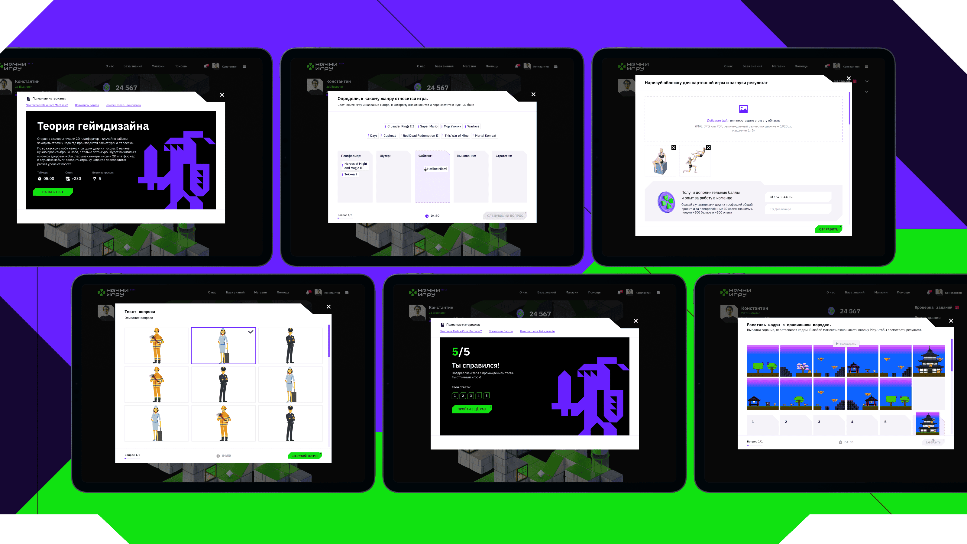
To pull off this scenario, we had to work through all possible cases of image usage on the site's pages, which took quite a bit of time. We handled each case in a specific way in terms of assigning or removing CSS properties. Additionally, we needed to designate some images as exceptions, as they should always remain visible to the user to keep the interface convenient and readable. For such cases, we added a special data-attribute to the images, which made them ignored when the "No Images" mode is enabled
Monochrome and Its Companions
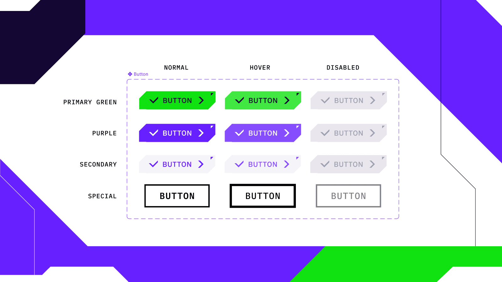
When creating the design for the accessibility version, it's crucial to adapt it for the most common vision problems. To achieve this, we developed monochrome variants, the ability to change font sizes, toggle images and sound on/off, and more. We also paid significant attention to hover effects and highlighting active tabs. We didn't forget about the order of elements either, ensuring it remains consistent across different resolutions—failing to do this would inevitably create difficulties when using screen readers and keyboard navigation.
All browsers have built-in solutions for keyboard navigation, and we wanted to use them. However, over time we realized that standard libraries incorrectly displayed the broken design; the outline was crooked or didn't display at all. So we had to get a bit creative.
To create complex object shapes, we used a CSS property called Clip-Path. It allows you to hide part of an element by creating a clipping region around it. But when it came to creating the accessibility version, another problem emerged. When trying to highlight an element using the Tab key, the outline still wouldn't display. To solve this issue, we created pseudo-elements and placed them over the elements that needed to be highlighted.
It's generally a good practice for any website, not just accessibility versions, to be keyboard accessible. If semantic tags are written correctly, 95% of this work pays off.
Maria, frontend developer at Mish
How We Optimized the Workflow
At our agency, we like everything organized; it simplifies work. Therefore, it made sense to organize the process when configuring site parameters so we wouldn't have to run around the entire project. For example, if we had developed all buttons from scratch, we would have had to make changes to each one when configuring the site.
So we extracted the button into a component and added a special state. In it, we specified conditions and embedded all the information about how the element should look when the accessibility version is enabled. This allowed us to write all requirements in just one file without having to go through all the others. But this is standard practice: we create components on all projects and extract them into a separate library. It is convenient and speeds up the process.
The site contains a lot of text that changes when the accessibility version is enabled, font size and letter spacing increase. Therefore, we handled text blocks the same way as buttons—we created a component that specifies all necessary parameters. Now, when switching to the accessibility version of the site, the component automatically commands all files. As a bonus, this feature makes it easy to add site narration.
What Conclusion Can We Draw?
Challenges make you stronger, for example unusual requirements you're not prepared for, short implementation deadlines, and limited budgets. In such situations, you can only rely on experience and your team. Therefore, read requirements carefully and don't be afraid to improvise and add useful functionality that will improve user experience.
Meanwhile, the first season of the "Start the Game" project has already ended. The finalists went to Kazan, predented their projects, and received financial support. The creators are preparing for a new stage of the competition so that those who didn't have time to participate in the first round or didn't pass the selection can try their luck in the second. We're adding new mechanics and tasks to ensure nothing prevents participants from reaching the finals.

More articles
Previous article
The Hidden Power of Business: Who Needs Account Management and Why
Hi there, this is Mish Product Lab, and me, Nikita, an account manager. I’ve been part of the team for two years now, doing what I love and making it count. In this article, I’ll share how account management works inside a digital lab, how to build expertise, and how to bring real value to the business

Next article
Resume Tips for Designers: Presenting Yourself the Right Way
At Mish, we receive dozens of resumes every day. Reviewing them and finding suitable candidates takes a lot of time, so poorly formatted emails often go unnoticed. To help you avoid being overlooked, we’ve put together a few recommendations.
